How Should You Outline Your Marketing Email Design?
How should you outline your marketing email designs? When designing your emails. The choices you make will create a different impression on the subscribers who receive them. Your emails are a conversation that helps your build trust by providing value.
Below we are going to go over the steps to outlining an awesome email design.
Your email design might change based on the type of email you are sending. The good news is that the steps you need to take will continue to be the same.
Some more good news is that you do not have to hire a web designer to help you create and design beautiful emails. Using these steps will work as an outline for you to design awesome emails.
Steps For Creating A Design Outline For Emails
- You want to always set a goal for your emails. By placing your email goal first, you will be setting everything else in that email up for success.
- You will Write and Design your email content inside of your email template.
- You need to concentrate on creating a consistent experience for your subscribers.
- You will be bringing everything together, plus create your call to action that will guild your subscribers to the next steps outside of your email.
Now let us take a more in-depth look at each of these steps to create an outline for your marketing emails.
Step #1 Set A Goal
You will have to set a goal for your marketing emails. You know to be successful that you have to establish yourself goals for everything you do, and when it comes to your marketing emails, it is the same way.
You will need to create goals that are larger than just clicks or open rates. These goals are your checkpoints of activity for your email marketing campaign, not your email goal.
Your main goal is not to have your subscriber download a pdf or something else. The central purpose of all your emails is to have a conversation with your subscribers, plus have them interact with you and your business.
Your emails, main goal can range from having your subscribers sign-up for a live webinar and attending, Reading a new blog post you just published, or engage with you and your business.
Example: For one quarter (3 months), we are able to generate a 50% increase in subscribers from our blog. We do this by increasing our advertising budget for a blog post that traditionally acquires us the most subscribers.
That is called a subscription-focused goal email. That has been deemed S.M.A.R.T. Goal, Specific, Measurable, Attainable, Relevant, and Timely.
Now once, you have clearly defined your email’s main goal that inspires a conversation and provides real value to your subscribers. You are able to move onto the outline of your email design.
Step #2 Write & Design Email Copy
In this step. You are going to use your email template for the content that you will write and design.
Your email content is your chance to show your subscriber the real value you are providing them. You want to layout the action your subscribers should take while creating a conversation that seems natural.
How you layout the structure and design your content will assist these initiatives.
You need to keep in mind the fundamentals of writing compelling copy (write for scannability, use the right tone, personalize when appropriate, and proofread) when creating your outline for how you want to structure your email copy.
All successful emails will use space efficiently. In other words, in every part of your email, both the content and your design. You need to arrange it in a way that supports your goal that you have selected.
We are going to create an email outline that you can use for an example.
I want to remind you that this is just a rough draft and will not look like an email right now. Do not worry, you will have it looking like an email when you are finished.
You will be able to use this example for all the emails that you create. True, each email can be slightly different, whether that is a separate desired action or goal. Using this type of structure will help provide a consistent feel, all the while saving you time.
Your email design is a way to communicate your ideas visually. Remember you are having a conversation with your subscribers. All the while guiding them through your content with your design.
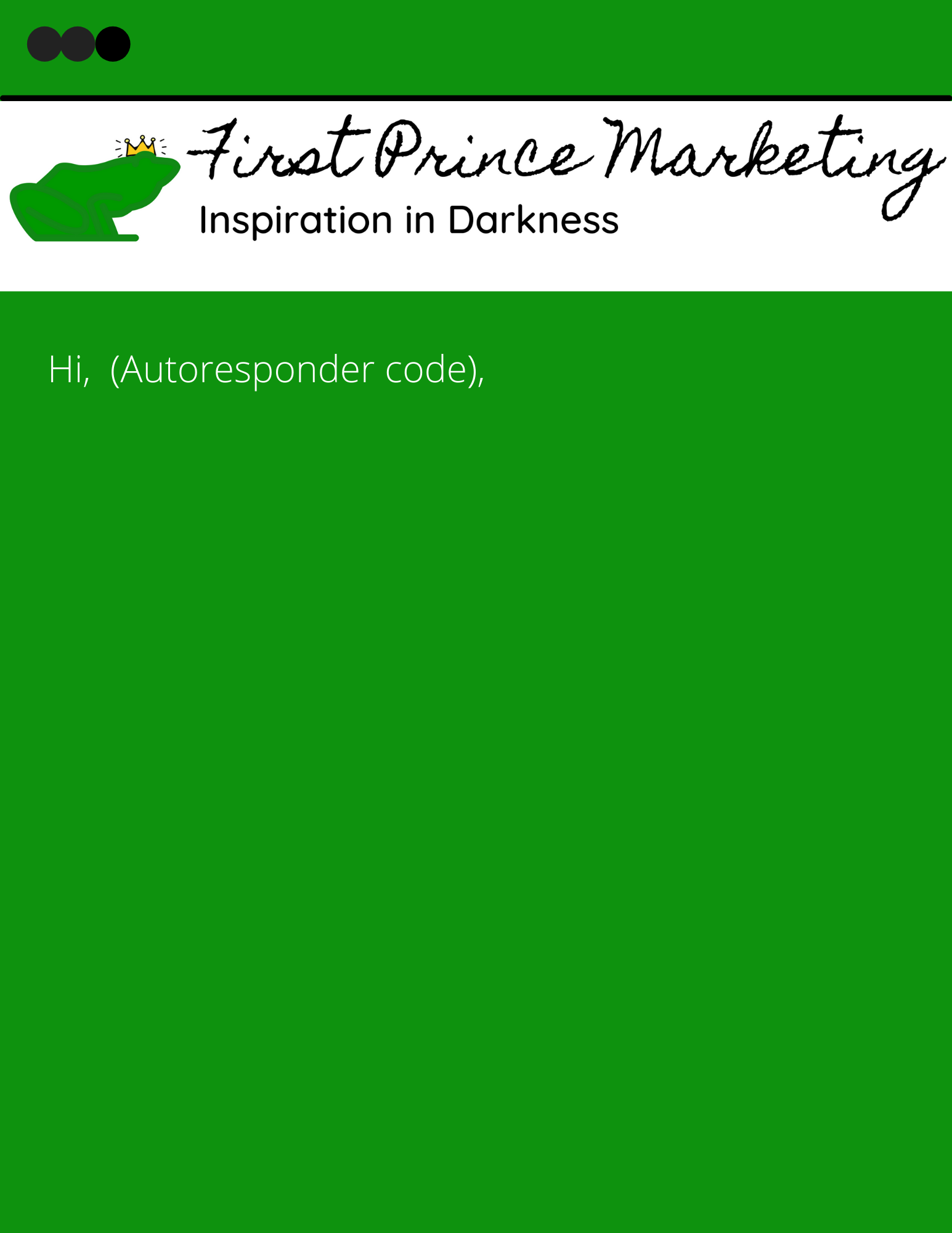
This is a copy of my marketing email template that I use. As you can see, it is nothing fancy but does work.
You will be adding content like the reply-to email address, which you will want your subscribers to use to have a conversation with you. Right now although, we are going to focus primarily on the design of the copy.
Think about the top of your email for a minute. That will be the first content your subscriber will see. Think about what you want your subscriber’s eyes to be attracted to at first?
Your logo, of course, is placed at the top of your email. You are doing this to make sure your subscriber knows who they are engaging with.
The next thing you want to do is add in your first personalization token.
Wait a minute what is, a personalization token? This is a small custom variable that you want to add to emails or website pages to signal the subscriber’s information.
Example: If a subscriber has entered their name when they joined your email list? Then you can add a personalization token to your email that will display their name.
It adds a nice little touch to your email. Remember to also personalize your content further in your email. To the segment of subscribers, you are sending too. You want to give your subscribers the entire personalized experience by adding these types of tokens. Use these types of tokens at the beginning of your email right after your greeting of hello or hi, place your autoresponders token code.
Note: Not All email autoresponders use the same token code, and there are different kinds of tokens. Some are for the first name, last name, date, and a few more. Your autoresponder, I’m sure, has a page just for showing you their token codes.
Alright, 25% done and only 75% to go of your email. Now tell the truth, was that hard? Now onto creating or, better yet, designing value in what you will be providing
Okay, you know what your email’s goal is. Your content here should coincide with that goal. You want to design your email content. So, that your subscriber does not have to determine what you are trying to convey, or even why they received your email. Plus, what their suppose to do with your content.
To help you convey your message quickly, use bolding, headers, and whitespace. By doing this, you will provide visual cues that will aid your subscribers in understanding what it is that you are conveying quickly.
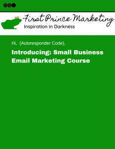
Let’s take a quick look at this template to see how you can add visual cues that will guide your subscriber through your content.
You will want to add headlines, bolding, structure, and try to reduce your email’s copy in order to make it easier for your subscribers to understand and consume.
Make sure to leave plenty of whitespace around your call to action, CTA so, that you can avoid high-density walls of text. In other words, you want your CTA to be easy to see.
By creating an outline such as this one, you can provide a structure that you are able to use for multiple emails.
As you can see, in this template, the outline can be used by sketching out the format you would like to use for your email sends. No, we are not done yet.
Step #3 Consistent Experience
Now that you have your outline for the design of your email. You are now able to move onto creating a consistent experience.
You can create your consistent experience by breaking it down into two main aspects: Your Brand and Email Subscriber or the Device your subscriber views your email with.
So that you can design your email better, let’s take a look at both.
Your Brand
To help your subscriber’s (tribe, followers, etc.) experience, you want to create a consistent experience across all the channels. Do this with all the places your contacts might be having conversations with you on. Your brand’s feel should be consistent even if your communication is on different platforms and subject you might be discussing.
These are things like your colors, language, logo, and even the editorial style you are using.
Have you ever noticed it’s the small things that make an everlasting impact? Well, your contacts are the same as you. It’s the small things that make the most significant impact.
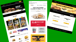
Here’s an example that I grabbed from Hardees, a fast-food restaurant, of their brand consistency across email and website.
As you can see from the picture above. You are interacting with Hardees. by the consistent look and feel that Hadees employees. Put yourself in your subscriber’s shoes and make it easy for them to recognize that they are interacting with you and your business.
Email Client and Device
The second part of consistency is more about your subscriber’s email client and the device they view your email with.
These two things can affect the design and functionality of your email. Why, because these two ecosystems can and do change the way your email looks? This is all based on your subscriber’s email client and the device your subscriber is using.
An email client could be Gmail, Outlook, Yahoo, etc., which is a computer program that allows you to access and manage your email.
An email client can and will display your emails differently. Each email client, desktop, webmail programming will render your email differently. And all of this means you won’t be able to provide a consistent experience.
Some autoresponders have a tool that allows you to test how your email will look across different email clients. But the real question is, what exactly can you do with the design of your email in order to provide the most consistent and valuable experience across the different email clients and devices?
The First thing you could do is provide a link to your original email that you have put up on your website. That will allow you to provide the experience you were looking for, for your subscribers.
The second thing to look at is the width of your email. It used to be you wanted to create your emails to a 600 pixels width, but that is no longer the norm. Now, that is an okay middle point to start because people are using all kinds of different devices. So, your emails also need to constantly change widths.
Just think about it like this, your phone’s screen size versus your laptop or desktop computer monitor. They are not the same size, are they?
Of course, the best way to solve this and give your subscribers consistency is to have your email width change based on the size of the screen or to use a mobile-friendly template for your email. No matter the screen size, the template adjusts, and the experience will stay the same.
There was a study done once where 1,500 customers were surveyed. They said the most important email element for their business was a mobile-responsive email.
Remember to always design your emails to give an awesome experience. No matter what your subscribers are using to view your emails on, to get the consistency you are aiming toward.
You want to make sure to combine these two key elements of consistency (your brand and the email client & the device someone views your email on). You can provide a consistent experience that will help build trust with your subscribers.
Step #4 bring all of this together
As you start to bring all of this together. You will want to also pay attention to the design of your call-to-action, CTA. The main goal of your email that you already chose. I want you to understand that your goal is tied directly with your call-to-action. Make sure your CTA is clear and actionable as can be.
Is your email clear on what your subscriber should do with your email, or what they should do next? Not to mention, how exactly can you use the design of the CTA to make this as clear as possible?
Your CTA needs to be larger than the print around it, with action words (Verbs) and enough white space around it. Doing this allows your subscriber to glance at your CTA and know what to do.
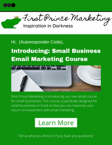
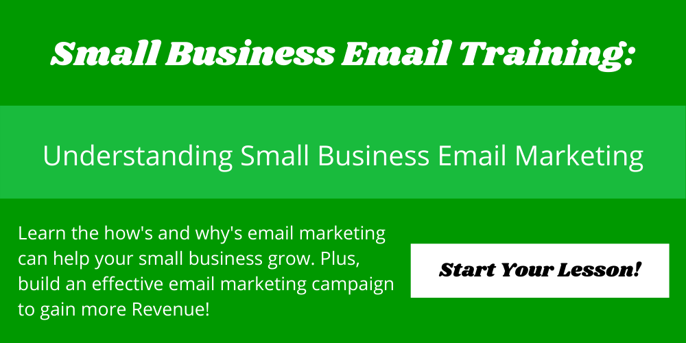
Here is an example of a CTA to look at.
As you can see, this CTA was designed, to guide readers to Small Business Email Marketing Course. Notice how the language is clear and actionable. Look at where your CTA sits in the email. The CTA sites where you can glance and know what you need to do next.
After you have designed your CTA and added it to your email outline. You will then be able to see everything come together.
Let’s take a look at what all of this might look like together.
Conclusion
You are able to use this guide on any email template. By using this guide. You will be able to clearly communicate your message, engage with subscribers in a conversation. Plus, add to your consistent experience across all channels.
By bringing all of this together and using this guide, when you are creating, any kind of email, you will be able to design emails that inspire conversations and provide value to your subscribers.
We here at First Prince Marketing are here to help you make the most out of every email you send. Let us create your email campaigns that can set your business apart. We have the knowledge to create each one of the email types listed above a reality for you, plus a whole lot more.
If your looking for an autoresponder to use for your business might I suggest GetResponce? “Warning: This is my affiliate link and I will probably earn a commission. But this is who we use ourselves and why we recommend them. 5⭐”



Recent Comments